


Goals.
Inspect and improve the current UX of the app and develop a new feature that allows users to create, host and share events in and out of the app.
The challenge.
Overview.
According to the Nummy team, there has been an increasing demand from users to host themed and invite-only events for company-new starters, supper club hosts etc.
Therefore, they would like to make this possible for their users by designing a new feature in which users can create private events they can share with their networks, in and out of the app.
They were not completely happy with the user experience of the current app. they hope that the UX team would be able to give some insight and assistance to improve Nummy’s user experience.
My role.
As part of the team we worked collaboratively on every step of the process but. I grew my skills in user research and competitive analysis and learned how to collaborate efficiently under pressure. I facilitated the design studio.
Key Tools.
Sketch
Invision
Pen and paper
Sticky Notes
Key Skills.
User Research
Wireframing
Prototyping
User Testing

Our process.
We approached the project Using Lean UX best practices together with the Double Diamond methodologies.
Discover.
we have decided to start the discovery process for the new feature, to gather more information on the app users and potential users we sent out surveys.
The survey purpose was to find out what people who participate in table sharing events or other foodies’ events (“guests”) are looking for when they are searching for an online event.
But that wasn’t enough, we understood that if we want a clear and comprehensive picture we also need to know what do people who host and create events are doing, what’s their pain points and how we can develop a tool on the app that will help them create and manage the event easily!
We realised that we need to look at “hosts” and “guests”, it required us to look at our problem from two different perspectives.
We got more than 50 responses and conducted 14 in depth interview with “hosts” and “guests”.
Synthesising trends from the interview helped us to understand better host needs and guests expectations, thus providing us with information and possible features to take forward.
To better relate to our user’s current user experience and emotions we decided to create an experience map for our “host” users.
Define.
We used the JTBD method as it was more appropriate for this project and its wide range of users.
J.D.B.D.
When Lisa hosts an event, She wants to manage and tailor every aspect of it on one platform, So that she will be less stressed about forgetting or missing something.
Hypothesis.
We believe that by allowing the host to create their events seamlessly on one platform, we will increase the number of hosts using Nummy as their sole event-creating app.
Design.
We met with our client for a design studio, together we came up with ideas to solve our problem, we “dot voted” on those ideas and the features we come up with and priorities them further using the Moscow Method.
Prototyping.
The overall purpose of this new feature is to help users (hosts) to create and manage events.
- This feature to tie in with the current app seamlessly.
- A form design that includes event information guests expect to see
- Form design that follows usability guidelines to help the user through the form in a logical and easy way
Todo so we decided to incorporate a new “host mode” in the shape of a button, on the homepage of the app, that takes the user through creating event process.
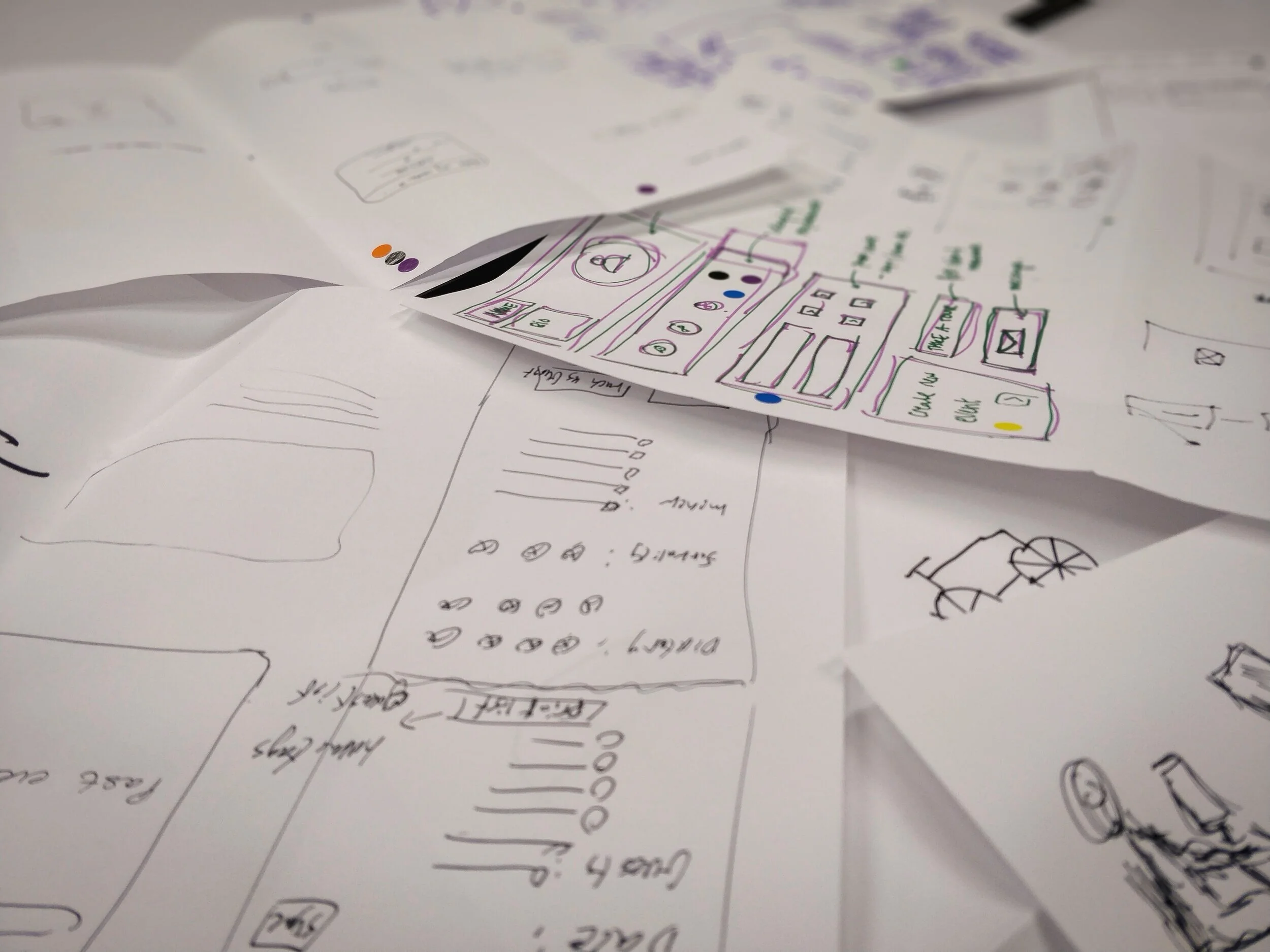
We started with paper prototyping, tested, iterated and tested again until it was well enough to go to high fidelity prototype, below are the prototypes and changes implemented after user feedback.
Based on the usability testing, the following changes were implemented, as shown above:
Users didn’t have a way to edit the information they entered in the preview screen, so we added some edit buttons in the mid-fidelity prototype
Users didn’t identify the “Guest Mode” on the top left-hand corner as a button so they weren’t able to go from guest mode to host mode, so we made it more obvious as a button in the mid-fidelity
Users thought the progression bar at the bottom allowed them to swipe back and forth in the process rather than just to show them where they were so in the mid-fidelity we moved the bar to the top and numbered it to make it more obvious
Users thought “occasion” meant things like birthdays or weddings rather than the meal type such as dinner or lunch, so in the mid-fidelity, we added a suggestion word to help the users understand
By incorporating user’s feedback, we designed a high-fidelity prototype which will further be tested and allow for further iterations to be made accordingly.
The result.

Further steps.
when we first used the app we noticed that the login process was too complicated. We further tested it with users and we found out that the onboarding process of the app was long, complicated (2:45 seconds on average to complete), not clear and frustrating, which lead to a big abandonment rate.
we further tested our findings with 7 users, 4 of them left the app and didn’t even complete the onboarding process.
We believe that by changing the current onboarding process, we can reduce the amount of time taken to get to the main body of the app and hence reduce the chance of abandonment.
We divided the onboarding process into two stages, first, log in and have a look at the app and then when you want to book a seat or become a host, complete your profile settings!
We also add a sign in with the Google button as most of the users said that they feel more secure to sign in with google.
Another problem we wanted to start working on, was the profile setting process. Users were confused with the current one, the insert details form field was not clear in their input location, the suggested text for each field was in a confusing colour, there was no specific indication if something went wrong to what it was, just a general notification and you had to fill al the details in order to move on.
We designed a mid-fidelity prototype that gives the users a choice to what is going to be shown on their profile, they could change and add as many fields as they want, the app also gives them suggestions to common fields.
It needs to be further developed and tested with users.
What I learned.
From communicating with stakeholders: it is important to get the key stakeholders on board with you as early as possible, in this case, it took a video of a user trying to log in to the app to convince the stakeholders to change the settings and trust us with the rest of the process.
From teamwork: Agree in the group on the path you want to take, listen to everyone and make a smart and conscious decision on the path you want to go down in. Otherwise, you will go round and round with no purpose.
From the process: As a UX designer, you have a lot of tools in your belt, knowing which one to use at what time takes practice, keep on practising to make impactful designs for business and users as one.
Problem statement: I learned that if you have a good problem statement, then you already have half of the solution.
On-boarding: It was important to improve the onboarding process first before we start working on the new feature, it was relatively easy and didn’t take a lot of time but made a big impact on the way users approached the app and left a good impression on the stakeholders.
*Developing and implementing a management tool for the “hosts” would improve the app tremendously.