


Goal.
Helping with the UX process to develop a wellbeing app for schools and students.
The challenge.
Overview.
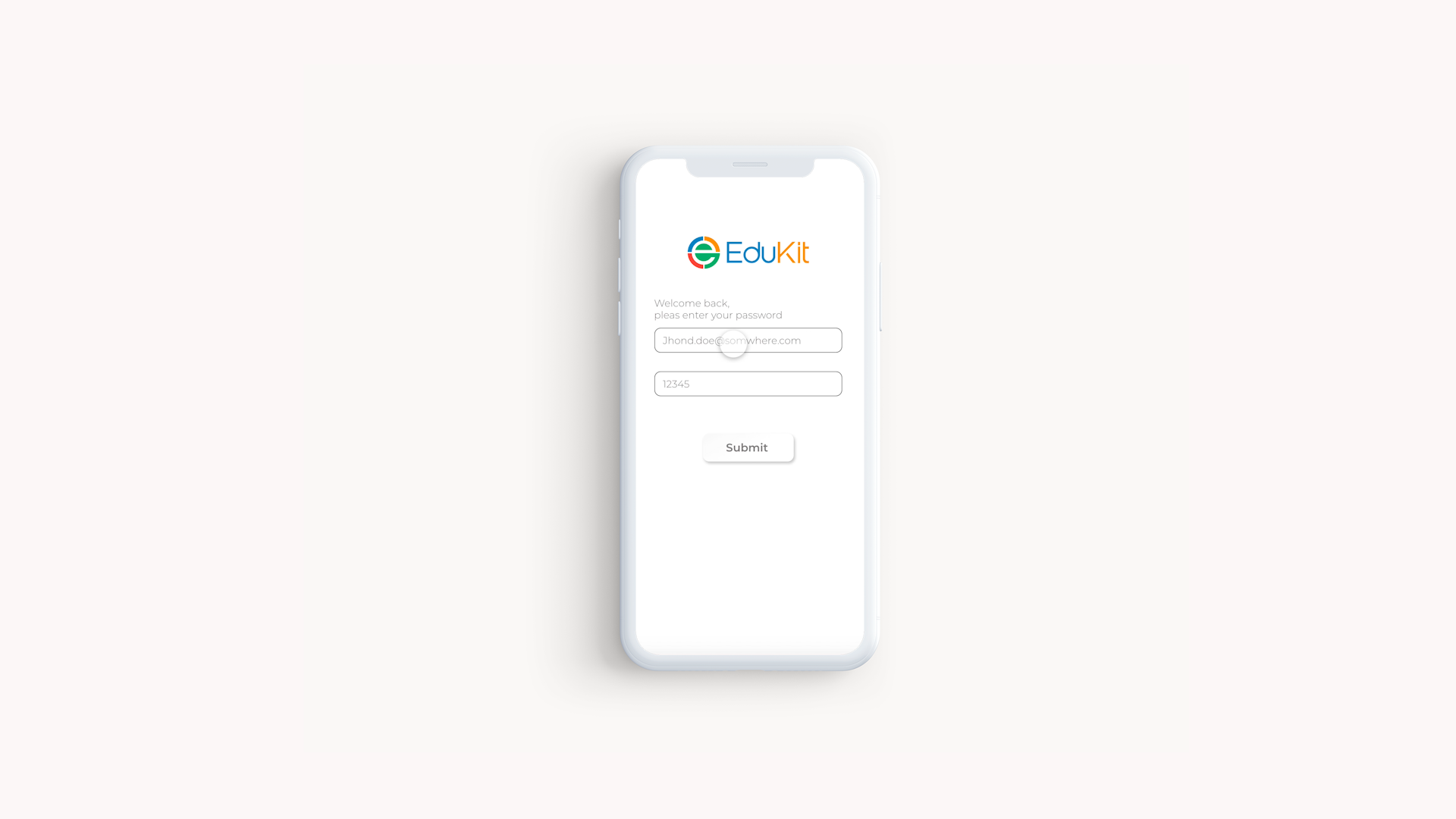
Edukit is a wellbeing app for students that provides insights to the teachers and school by students’ surveys, the app then provides bespoke resources, allocated by the school to the student, such as videos, articles or websites, to help them maintain their wellbeing and deal with problems like bullying, anxiety etc.
The app was launched as an MVP a week before I was called to help EduKit with the UX/UI of the app.
My role.
As I mentioned, the app was already live as an MVP, I audited the current app, conducted stakeholder and users interviews, managed the project roadmap and objectives.
Key Tools.
Adobe XD
Balsamiq
Pen and paper
Sticky Notes
Zoom
Key Skills.
User Research
Wireframing
stakeholder interviews
Time management
My process.
In order to understand where we’re going, we need to look back sometimes, I used user-centred Design best practices together with the Lean UX process to validate and explore the way.
Empathising.
Because I was called to consult after the app was live, I wanted to look into Nathalie’s research and her motives to launch the app. I also talked to parents and school kids to get more insights on schools to approach students wellbeing.

Interviews.
Understanding the business needs while advocating for the users was one of the key goals, to do so I reviewed all the interviews done by the Edukit team in the early discovery phase and talked to key stakeholders in the team to understand
After reading all the interviews with schools staff and students, using affinity mapping I got some great trends and common pain points, this helped me later to establish my hypothesis and problem statement.
Key insights- schools staff.
Communication- schools needed a better way to communicate with the student other then emails or calls to the parents because by talking to the parents you don’t always get the right input.
Tracking- schools needed a better way to track the support they provide, for the process to be self-managed and for the support to be quicker.
They needed a simpler and easier way to identify issues with students.
Schools would like the students to take ownership on their wellbeing as a way of living. (motivation to use the app)
Key insights- Students.
95% of students have concerns about their wellbeing.
70% of students will share resources with their peers to help them deal with wellbeing issues.
Most Students use online content to care for their wellbeing.
There is a lot of concern regarding the content they see online. “content can be very inspirational from one hand but can be very toxic from the other.”
Student would like to take ownership on their wellbeing.
as I mentioned, after going through the interviews I also talked to the key stakeholders, Their insights and takes on the direction of the app and their motives to develop it helped me to understand how can I help and to better clarify the direction to take.
Key insights from stakeholders.
Schools needed a better way to communicate with the student other then emails or calls to the parents because by talking to the parents you don’t always get the right input.
Schools have a problem tracking the support they provide to students.
They don’t identify issues with students fast enough.
Schools would like the students to take ownership on their wellbeing as a way of living.
Bussines KPI’s
Competitor analysis.
We hardly ever inventing the wheel as a designers, by looking at what is out there we can understand what our users expect, see what works well for them and what not, so we can better build our product.
I looked at direct competitors like the childline app “For Me” and indirect competitors like “Headspace”.

“For me” offers a way to lock the app with a code, a mood journal, also a community same as “UniWellbeing”, you can chat with.

Headspace content and UX is especially good for a wellbeing app, the simplicity of the content stracture is something we can learn from.
From all the data gathered I could create a persona to better identify with the users
As the group age of users for the app is big and differentiate a lot in cognitive ability, I created 2 persona groups.
Current app Audit.
After understanding the user’s needs, to learn more about the current app, an audit on and to set a benchmark to measure the improvement of UX from the changes we will implement, an audit of the app was necessary.
1. Top section of the app takes a lot of space from an already limited one.
2. No indication on what is the content presented, why is it there and why should I use it.
3. Further testing is needed to determine the necessity of the function “mark as incomplete.”
4. The library look is outdated, as this app is designed for teens and kids, a more modern and fun look would be better.
5. The use of the work activities needs more testing, a further explanation on what activity the users are doing is recommended.
6. When designing for kids they should understand the action they need to take on each screen. Explanation messages should be used in rarity, I would suggest covering all the features in an onboarding screen presenting the app and its functionality to users, further “hints” could be implemented in the app.
7. A call button should be included for quick access.
Going through the research process was helpful in understanding the product and business direction and in turn gave the stakeholders understanding of the process.
Define.
How can we know if the product to be successful? how can we know we are solving real problems?
That’s where the use of all the insights from the research comes in handy!
Together with the problem statement, I created a user journey to show the optimal flow of our persona in the app to achieve its goals.

Problem statement.
Using our persona, empathising with him and crafting the problem statement.
Jack (persona) have difficulty finding reliable resources and inspiration regarding his wellbeing.
He needs a better way to communicate, find resources and get inspiration.
That way he will feel less stressed and more relaxed in general, be able to concentrate better on his study and take ownership of his well being.
Hypothesis.
We believe that by developing an app that collects data from students about their well-being, through surveys and other questionnaires.
We would be able to help schools/teachers identify students with issues much faster, they can then allocate in-app resources and self programs to students, so they can take ownership of their wellbeing.
By doing so they will share the app and help other students to support their well-being.
Design.
At this stage I had an understanding of what students are expecting to see and what schools need to have on the app. That allowed me do consider the features on the app and the general look. I began prototype on paper and then moved to low fidelity on XD to make it clearer to the team.
Low Fidelity on XD Explained.
1. Profile section, has been created for more personalisation according to user demand from research.
2. “To do list”, and “get inspired” in plain sight and high in the hierarchy, according to UX best practice, and insights from research.
3. “How are you feeling survey”, close down after the student fills it. Contain 5, not 3 points, according to UX best practice.
4. “Things You might like”, to encourage students to stay on the app and to show content we want to promote.
5. Lower bar, fixed position. Contains the main categories and home screen. Relevant categories are highlighted to show where the user is.
6. Back button, for easy use and a header off the section the student is in.
7. Quick call button for child-line according to UX best practice
8. Lower navigation is highlighted.
9. Favourite icon and filter icon, both on the top for easy recognition and use.
10. Categories titles and names with an illustration background too, make them more appealing and playful, not threatening.
11. Add to favourite button, for quick access to favourite or more frequently visited topics.
12. Inside each category, the user is presented with the content in each categorie. Users can filter according to the type of content, length, highly rated etc.
13. A title and a short description of the content, users use to look at this type of libraries and we should present something known to them.
14. Video title and video box, video switching to full screen when the phone is flipped are expected outcompetes from a video player.
15. Like, save and share buttons
16. when pressing save, an options menu appears, if save to the scheduler’s selected user then will be taken to set an alert for this content. The schedule screen should use the date pickers dedicated to the OS of the phone for more simplicity and be of use by the user.
17. Share options, usually according to iOS options.
18. Schedule screen, today’s date in a simple way, together with a weekly timeline showing tasks as colourful dots on the day.
19. a day with a task will present the tasks below with a short description of the task, colour coded to identify different tasks. For example, video in green, article in orange etc.
We came together to a mini design studio when everyone presented his designs and we iterated on the best ones to move forward with. I then began to design the mid-fidelity prototype of the app.

Screens after mini remote design studio.
Clickable (Mid-Fid) prototype.
Success metrics.
We will see the number of app downloads increasing.
we will see good reviews on the app and android store, this will also provide important feedback.
we will see time spend in-app increasing.
we will see low “Time on task”, low user error rates. These are directly related to UX and provides insights into the screen flow and if users are abandoning the app frustrated.
The task success rate will be high.
The user satisfaction rate is increasing.
User interviews will give us in-depth insight into user behaviour.
What I learned.
From the process- It was the first time I took ownership of a UX process, I learned first-hand why it is important to bring the stakeholders on board from the beginning, how to manage them and to keep them in the loop.
From the design -I presented my design but eventually due to constraints of time and money, I implemented the changes into the current design. it is important to plan for the unexpected and to define clear goals.
Moving forward- Edukit team now have a comprehensive look at the app and research, if and when they’ll decide to move forward, they have all they need ready.
Research shows that It is optimal to design the app for several groups age in different ways, but that could take a lot of time and resources, I suggested solving this by implementing onboarding screens to explain the functionality of the features in the app and implementing certain “help” features or “hints” for younger kids. Given time I would like to explore this further and ideat on the best way to do that.
*Unfortunately due to certain limitations beyond my control, the stakeholders decided not to continue with the development of the app.